
Soft-touch, matte or linen: choosing the paper your customer touches first
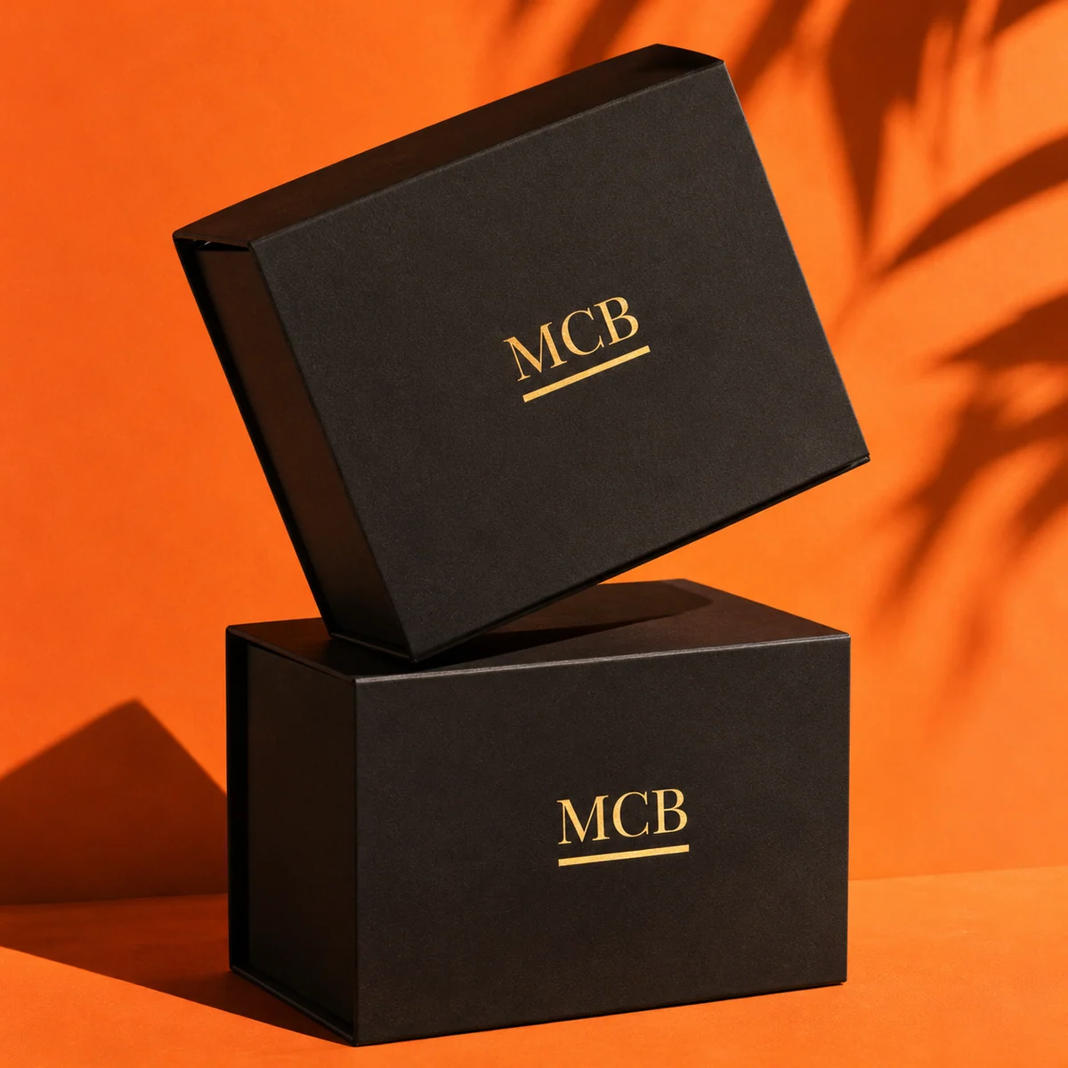
The paper wrapped around a rigid box is the first thing your customer touches. Before they see the product, their fingers have already decided whether it feels premium. Here is how our five papers compare, and what each suits best.
Soft-touch black
A velvety, slightly rubbery finish that absorbs light. It makes gold and silver foil look brighter and shows almost no glare in photos. It suits fragrance, jewelry, electronics and anything sold on a “quiet luxury” feel. It does show fingerprints a little more than matte papers, which most brands see as part of the charm.
Matte white
Clean and bright, it lets full-colour printing and coloured foils stand out. A good choice for skincare and wellness brands with a minimal look. White shows scuffs more easily in transit, so we recommend a protective outer mailer for shipping.
Kraft
A natural brown paper with visible fibres. It reads as honest and eco-minded, and pairs well with black print or a deboss. Kraft suits candles, apparel and food gifts, and hides small marks better than any other paper.
Sage
A soft grey-green that photographs beautifully and feels calm. It works with gold foil for a botanical look and is popular with skincare and home fragrance brands.
Linen
A paper with a woven texture you can feel. Linen adds depth to simple designs and takes emboss and deboss very well. It suits stationery, apparel and keepsake gift sets.
How to choose
- Pick the paper that matches how your product feels, not only how it looks.
- Foil logos look strongest on soft-touch black and sage; emboss and deboss look strongest on linen and kraft.
- Still unsure? Our sample kit has every paper and finish, so you can compare them in daylight next to your own product.
Every paper is available on all box styles, from 50 units, with a free design proof.